Dance and Music Academy
Web Design, HTML + CSS, Mobile Development
Dance and Music Academy has been enriching the community for 15 years. DMA takes great pride in providing a curriculum that is tailored to individual desires.They allow participants to thrive in the areas they choose to explore.They are dedicated to empowering young minds through the arts and find great value in knowing each student on a personal and artistic level.
Vision for the Site
My client's two main goals were for current students to be able to access class information easily and for new visitors to become familiar with the studio's philosophy and training style.


The Challenge
DMA had a non-responsive, disorganized, outdated website that was in need of a redesign. The client expressed a desire to revitalize the look and feel of their site and provide better user experience for their customers.
The Solution
To simplify and focus on core content
Improve the ease of use of the website
Update the site’s aesthetics and functionality
Evaluation of Dance and Music Academy’s Old Website
The redesign of DMA’s website began with an evaluation of their old website. While attempting to navigate their old site, I was overwhelmed by the amount of information I had to look at all at once. There were too many links in the main navigation. The site felt confusing and overly complicated to look at. As a first time visitor, I wasn’t sure where to focus my attention first. I knew immediately that I wanted to simplify the site. I wanted visitors to have an easier time directing themselves throughout the site.

Simplifying Content
Strategy Session
During our initial strategy meeting we tackled the site’s structure. I recommended that we cut out any unnecessary content currently living on the site. We streamlined it to include only what was directly aligned with her current goals for the site. We would concentrate on what was most important and relevant to her existing and forthcoming customers. This was for current students to be able to access class information easily and for new visitors to become familiar with the studio’s philosophy and training style.
We also sketched out a basic site map / structure for the site. Sitemaps help to clarify what your site’s goals and purpose are before starting design or creating content. We took note of the pages that would live on the site, the links for the main navigation and footer, and any new content or images that needed to be created.
Sketching and Wireframes
After this initial discovery session, I started the process of sketching out initial ideas for wireframes. I went through 8+ sketches to try to dish out as many possible solutions before starting on wireframes.
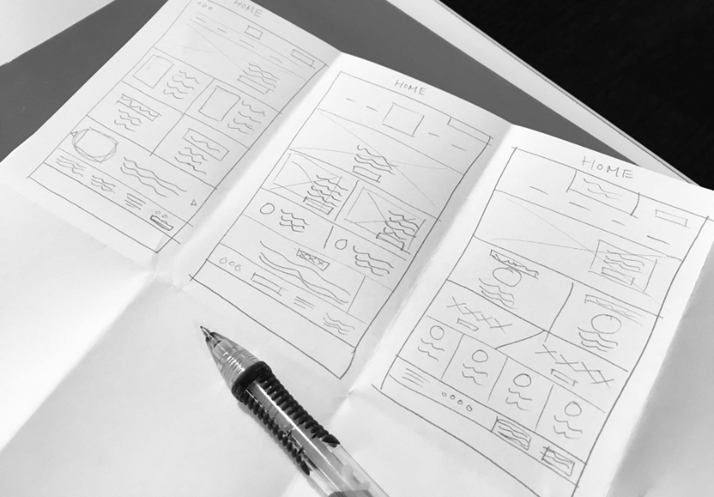
Sketches
I created wireframes for the homepage, classes and performance company pages. Wireframes help provide a basic structure for the layout of your site before you start incorporating more visual aspects to your design. It helps with the usability and organization of your site's content.

Wireframes
Improving Ease of Use
Usability
We decided to reduce the amount of links on the top navigation to create a clearer, more effective experience. The client mentioned that registration on her old site was successful, so I made sure that it would have a prominent spot on the website. I placed the ‘Register Here’ call to action within the main navigation so users could always be one click away. Clear call to actions were used throughout the site.

Navigation
Design
Capturing the Studio's Brand Through the Use of Photography
While designing the website I wanted to capture feelings of inspiration, strength, and exceptional training. I wanted the photography and imagery in the design to be full of emotion and feel impactful and awe-inspiring. The impressive photo of the dancer used in the hero banner immediately conveys the beautiful artistry and expressive dance training that the studio provides. These characteristics were used consistently throughout the site with other design elements such as colors and typography.

Dance and Music Academy Photography
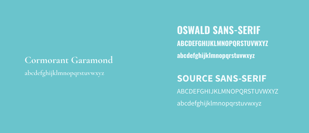
Capturing the Studio's Brand Through Typography
A serif font was chosen for the links on the navigation to stay consistent with their existing logo and the studio’s sense of artistry. The other font selected was a modern, bold sans-serif to embody the attributes of strength, value, and excellence.
Vision for the Site
Vibrant and energetic images of current students are distributed throughout the site to capture the audience's attention and to illustrate what the dance academy is all about.

Responsive Update for use on Mobile and Tablet Devices
Lastly, the website was not mobile friendly, so it was adapted to give young users the ability to access all of the site’s information on their phones or tablet devices.